Optimizing baggage selection for flights
AirAsia
Designing an efficient, effective, engaging and easy-to-learn user experience for selecting baggage for a flight booking app

Date
Mar 2022
Duration
1 month
Client location
Malaysia
Team size
4 Persons
My role
UX Research
Usability test
Ideation
Overview
AirAsia is a multinational low-cost airline headquartered in Malaysia. They are seeking to optimize the baggage selection experience on their flight booking app.
The re-design resulted in an improvement in the system usability scale score by 17%.
The solution

The problem
Baggage is one of the items that AirAsia sells as part of flight booking. They face the following issues with their current design:
-
Users are unclear about the various baggage types
-
Design needs to cater to different business rules for baggage selection for AirAsia and non-AirAsia flights
Their development team has come up with a preliminary improved design. However, it has yet to be tested due to the reduction of international flights because of the ongoing COVID-19 pandemic. Hence, AirAsia was not sure if this design is optimized to sell baggage for both AirAsia and non-AirAsia flights.
The goal
Test and improve on the preliminary design for baggage selection on the AirAsia mobile app for the Southeast Asian market.
Discover
What are our research objectives?
As AirAsia has yet to extensively test their preliminary design, we wanted to find out what usability issues users might face. In addition, we also wanted to understand how other online travel agents manage baggage selection. Hence, the team established the following key research questions:
-
What issues do users encounter for baggage add-on selection in the flight booking flow in the preliminary design?
-
What is the user experience like for baggage add-on selection for other online travel agents?
Competitive analysis
To understand the user experience and market trends for baggage selection when booking flights, the team conducted a competitive analysis of other online travel agents, as the information is easily available for us to identify possible opportunities for improvement.
We selected 4 online travel agents instead of airlines, as they provided a similar range of offerings and flights as AirAsia. We looked into the following areas:
-
When do users select baggage add-on?
-
How are baggage options presented to the user?
-
How do users select baggage add on?

What did we learn?
Strengths
-
AirAsia has already provided baggage selection options within the flight booking flow itself for a more efficient experience
-
Using the “thumbs up” symbol to indicate the recommended weight provides for a cleaner interface, compared to tooltips used by competitors which adds to visual clutter.
Possible improvements
-
Changing the colour of selected baggage options to provide greater visual contrast.
-
To provide more clarity that the baggage weight selected for checked baggage indicates the total weight of all checked baggage for one passenger, without a limit on quantity.
Usability test
As we wanted to observe how users interacted with the preliminary design, we conducted a usability test with 6 users. I led the recruitment of users and we recruited users from Singapore, Malaysia, Thailand and the Philippines to represent AirAsia’s target user group.

As the business rules for baggage selection are different for AirAsia and non-AirAsia flights, we structured the usability test script to cater for scenarios to test out the 2 user flows:
-
Baggage selection for AirAsia flights
-
Baggage selection for non-AirAsia flights
Synthesizing our insights
With all the findings gathered, we needed to synthesize and prioritize the insights to guide our design. We used affinity mapping to categorize the users’ pain points, needs and wants.

What did we learn?
-
Users were overwhelmed and find the page too cluttered
-
Users were unclear whether baggage option is selected
-
Users had difficulty navigating to Add-ons from Guest Details page
-
Users want greater variety of baggage options
-
Users want more colour in the product
Define
What should we focus on?
At this point, as we were on a tight timeline, we realized that we would not be able to work on all the insights and we needed to prioritize what to focus on. We worked with the client to establish the areas to work on first, using the following considerations:
-
Business impact
-
Complexity to implement
-
Expected usage
-
User groups

From our prioritization exercise, we identified 2 key Insights to focus on:
-
Users are unclear whether baggage option is selected
-
Users are overwhelmed and find the page too cluttered
Develop
How did research influence design?
The team brainstormed and came up with a re-design to address the key pain points.
Insight #1
Users are unclear whether baggage option is selected

For AirAsia flights

For non-AirAsia flights
Insight #2
Users are overwhelmed and find the page too cluttered

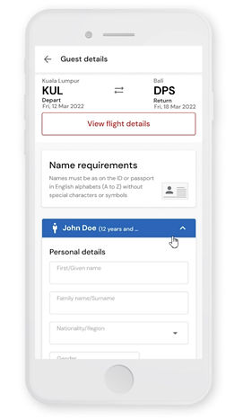
Flight details page
Deliver
How did the optimised design improve usability?
We conducted a 2nd usability test using the optimised design on Maze, and got the users to complete a System Usability Scale survey.
The optimised design showed an improvement in System Usability Scale score by 17%.


What are my takeaways?
-
Use comparable methods. Due to the time constraints, we conducted an unmoderated usability test for the optimised design, while the first usability test was done via a moderated test. Hence, we were not able to get a comparable basis for some of the success metrics like the task completion time. If we had more time, I would do another moderated usability test instead of an unmoderated one.
-
More iterations. The team could have spent more time having more rounds of iterations to brainstorm on design ideas and improve the design further.
-
Consider stakeholder needs. While it is important to be user-centric, it is also important to empathise with the stakeholders and consider business needs and impact, and help stakeholders understand how the design solutions impact the business.